


- United Kingdom
- Deviant for 16 years
- citisky.net
- He / Him
Badges
My Bio
Current Residence: UK
Operating System: Windows Vista, XP, Ubuntu
MP3 player of choice: iPod
Personal Quote: Nothing is impossible, you just need to find the answer
Operating System: Windows Vista, XP, Ubuntu
MP3 player of choice: iPod
Personal Quote: Nothing is impossible, you just need to find the answer
Favourite Gaming Platform
PC and Xbox 360
Tools of the Trade
Photoshop, Illustrator, Gimp, Inkscape
Other Interests
Graphics, Web Design, Cool looking things
Dragon Guards
0 min read
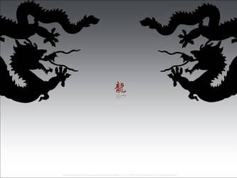
So I finally had a bash at finishing off my dragons which I've been building since the last deviation and I got to the point that it is quite representative in a silhouette form, so I decided to put these into a wallpaper with refreshed feelings.
It is summer, I thought maybe a bit lighter colours would be more suitable, so I made the background white->light grey gradient. This makes the silhouette stands out.
But I had a hard decision to make it work. I'm kind of against the idea of clashing colours, so black over white is too drastic. I'd like it more laid back, but if I used more dark greyish colours as the background, it wouldn't have w
Join the community to add your comment. Already a deviant? Log In
Upcoming deviants
0 min read
I'm planning to create a portfolio of very far eastern minimalistic art work. Specifically Chinese style and through these art works, I plan onto creating a Chinese style website that says "cool" and "modern" but as soon as you see it, you know it is Chinese.
It's something I haven't been able to do yet, but soon. When I get some time off on my final leg out of University. It'll be bliss.
Later
Join the community to add your comment. Already a deviant? Log In
First day at deviantART
0 min read
Wow, my first day and my first two submission and my first official watcher :) Thanks teuchu!
I hope to learn much more about the art of design and graphics from many of the artist on this site :). Afterall, I'm simply an amateur trying to get into the trade.
Admittedly I'll probably won't ever be able to match the good artist, well maybe that's why I like to keep my artwork simple and minimalistic :D.
Anyhow, this is my first step towards success.
Later.
Join the community to add your comment. Already a deviant? Log In
Profile Comments 2
Join the community to add your comment. Already a deviant? Log In